 TCM Bio Hub
import matplotlib.pyplot as pltimport seaborn as snsimport numpy as np
# 设置风格sns.set(style="whitegrid")
# 生成数据x = np.linspace(0, 10, 100)y1 = np.sin(x)y2 = np.cos(x)
# 创建图表plt.figure(figsize=(10, 6))plt.plot(x, y1, label="Sine Wave", color="b", linewidth=2)plt.plot(x, y2, label="Cosine Wave", color="r", linestyle="--", linewidth=2)
# 添加装饰plt.fill_between(x, y1, y2, color="gray", alpha=0.1)plt.title("Line Plot", fontsize=15)plt.xlabel("X-axis", fontsize=12)plt.ylabel("Y-axis", fontsize=12)plt.legend()plt.show()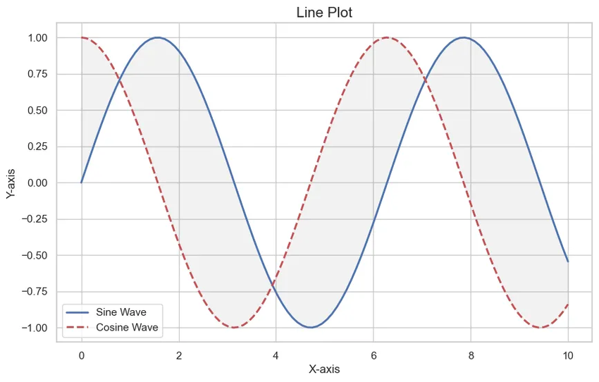
测试测试